Project Summary
Role
UX/UI Designer and Researcher
Duration
4 weeks (2021)
Introduction
I present you with the project RecipeZe (Recipe + Easy). But it can also be read like Recip-Ease which could be also like Recipes. As you might notice there is a lot of opportunity for word-play.
The objective was to design a food recipe app that helps users receive personalized suggestions based on their usage, inspiration when not knowing what to prepare and visual representations of the food they where preparing.
Process
As a way to provide a solution-based approach to solving the problem, I followed the design thinking process.
Concept
RecipeZe is an app that aims to provide inspiration on what food to prepare along with the recipes to people who might need help deciding on what to cook, by offering them options based on their activity and previously favourited recipes.
On top of that, the app has useful features that enhance the experience whilst a user interacts with the app. EG. The Shopping list/Map tab displays the closest store according to your position.
Problem
Users wanted an app that offers them a personal experience whilst providing recommendations for recipes to cook and inspiration when not knowing what to prepare.
Solution
An app that provides a personalised experience for our users by recommending relevant meals to cook, offering options for alternative ingredients and step by step cooking guides amongst other things.

Research & Analysis
Competitor Analysis
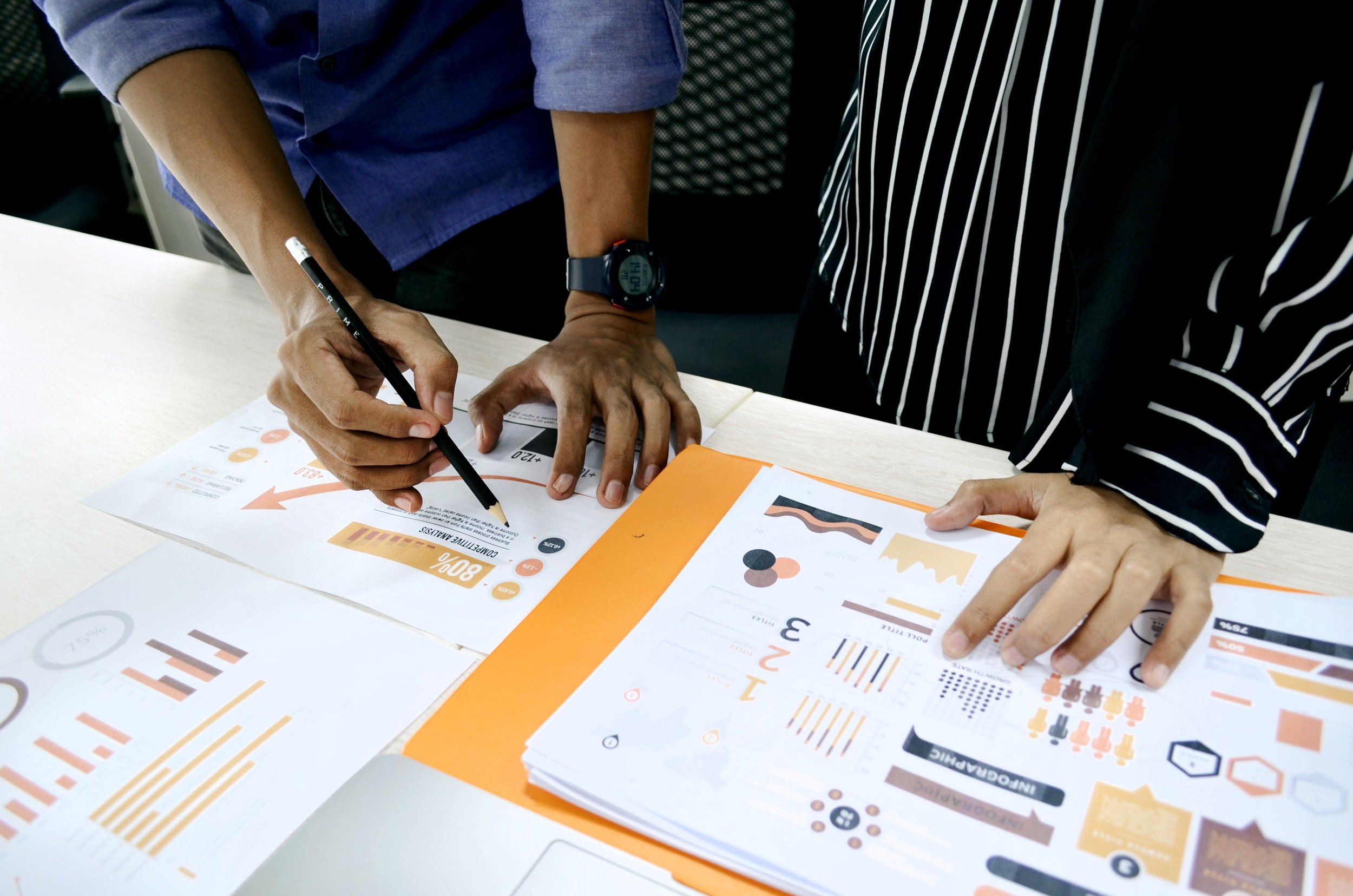
To understand the current food recipe app market, I decided to conduct a competitive analysis. For this, I looked at some popular recipe apps with similar characteristics. Some of them are the ones that I have personally used.
Personalises the user experience by customising meal plans, personalised recipe recommendations, and smart shopping lists.
Has a more community approach, much like a social network where users can share recipes called 'stories' and learn from other home cooks.
A pocket cookbook that allows users to look for recipes and prepare something quickly.
Then, I decided to conduct a heuristic evaluation on how these apps help users explore meal options.
Key characteristics of this evaluation:
User personalisation enables the app to learn from users’ likes & interests.
Freedom for user customisation and user control.
Ability to easily browse recipes based on cuisine categorisation.
Ability to find recipes based on available ingredients.
Overall style, visual and aesthetic appeal.
Understanding the User
Objectives of my User Research:
Who am I designing for?
People who are looking for new cooking ideas and don't have much time to cook. Food lovers who enjoy cooking.
What goals or tasks will the user accomplish when they use the app?
The user will be able to find recipes for meals they wish to cook easily. In addition, easily understandable cooking steps and videos can guide the user in their cooking.
When will the users use the app?
The user will use the app before making a meal or looking for cooking ideas, or planning their grocery list.
How will the users use the app?
The user will use the app on an iOS device only.
Why will the user choose to use the app, and what will drive user behaviour?
The user will use the app to look for a recipe quickly. The app will support ease of navigation and guide users in cooking a meal without any frustrations. Also, enable them to substitute a recipe ingredient based on what they have at home.
How will the user accomplish their goals through the app?
The user will be offered various food group categories to choose from. The user can also use the filter option to narrow down search results to find recipes according to their needs. Additionally, the user can follow the recipe step-by-step, either by photo or video instructions.
Target Audience
Working Professionals
Students
Nutrition Focused Groups
Persona
This is Lois. She is 27 years old.
She teaches at a local primary school. Her job demands most of her time during the day.
By the time she gets home, the last thing she wants to do is figure out what to make for dinner. Lois lives with her partner and she does most of the cooking for both of them.
Goals
Wants recipe ideas that don't take too much of her time and are easy to prepare.
Wants to cook tasty, delicious food
Cook meals from trust sources.
Improve her nutrition intake by making healthy meals.
Frustrations
Worried about how the results would turn out.
Too many options to choose from.
Has to come up every day with unique, tasty ideas.
Text instructions don't always provide proportions and the need to scroll up to see the ingredients whilst looking at a recipe.
Empathy map
Direct
Competitors
Indirect
Competitors

Visualization & Design
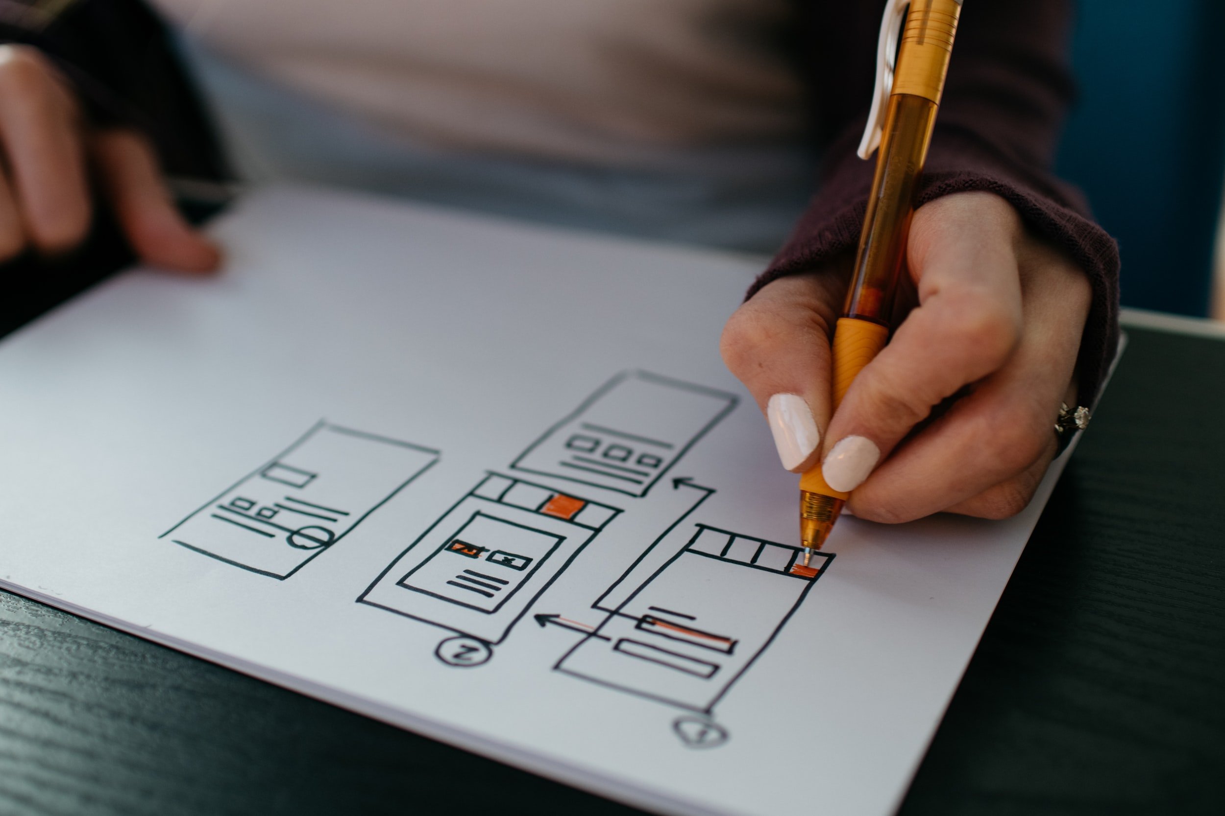
Sketches
1st - Home Screen
2nd - Discover/Trending page
3rd - Recipe (1/2)
4th - Recipe (2/2)
Wireframes
Homescreen
Categories
Recipe
Recipe ingredients (when opened and pinned to the top)
Prototypes
Homescreen
Categories
Recipe
Recipe ingredients (when opened and pinned to the top)
Homescreen & Categories Screens
Recipe & Ingredients Screen
Reflection of the project
During this project, I learned the importance of user feedback and how it may shape, change and enhance a concept. In my case, each user had different needs and expectations of their ideal recipe app, so the challenge was picking which niche to focus on because it is impossible to please everybody.
With more time I would have been able to turn my designs into a fully-fledged interactive prototype, which would have been a useful tool when conducting interviews on the final concept and design.
To make the process more efficient, I would have conducted interviews with users of potential competitors' apps in the beginning, before the concept phase.


