Here are logos I have worked on from previous projects
"Creativity is contagious - pass it on." – Albert Einstein
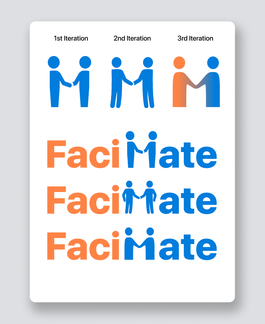
Further iterations of the FaciMate logo
Based on the feedback I received from interviews, I made the following iterations. After many different designs and ideas, I went on to design the FaciMate "M" as per the original 1st iteration and focus only on the “M” but also representing it as two people connecting, meeting or greeting.
This is the final version I decided to run with in the end. The colours were inspired by the original brand colours I went for which are meant to be:
Orange #FD8345 - Friendly & Confidence.
Blue #007CDC - Trust & Dependability.
Here you see the logo in its more typical or common use as is the norm in magazines. Since it is on a white background this is the dark version of the Flax logo. Both colours are meant to invoke a sense of dependability.
Flax #EFDF89 - Dependable & happiness
Deep Space Sparkle #3A5E6D - Positivity & Trust
Magazine Assignment
This was a logo I made for an assignment for creating a magazine cover and layout. The images are self-taken as well as a bonus.
The idea behind this logo is the word “Explore” with the world and a compass making very relevant to the theme of it being a travel magazine concept.
Final RecipeZe logo
This is the logo for light backgrounds.
And this is the original logo intended for dark backgrounds showcased in an icon format.
Colours:
Orange #FF9500 - Cheerful & Friendly. Also complimentary to the green
Green #91B26A - Natural & Healthy
White #FFFFFF - Cleanliness and Familiarity/Relatiblity to a classic kitchen.


